
Choose a project category to find out more about my work.

Metromoheim Museum Project
Project Source: Coursework
Exhibition Catalog
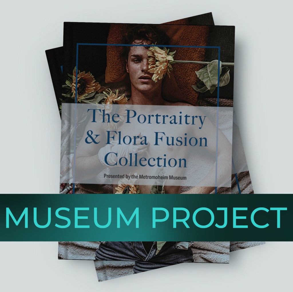
The Portraitry & Flora Fusion Collection is a museum art book designed to introduce visitors to a fictional photographer and showcase a collection combining portraiture with floral imagery. The book includes a cover, table of contents, artist profile, artwork descriptions, and closing collection page.
I used repetition, white space, hierarchy, and consistent blue framing to connect the pages while allowing the photography to remain the focus. The artist profile uses image placement and text wrapping to create movement, while the artwork spreads use restrained formatting so each photograph has room to breathe. This project demonstrates my skills in publication design, typography, image selection, and creating consistency across a multipage document.
Exhibition Newsletter
The museum newsletter was created to introduce visitors to all three artists featured in the museum’s exhibit. While the accompanying art book focuses more closely on one artist, the newsletter provides a broader overview of the exhibition and gives each participating artist space within the same publication. I used consistent typography, color, image treatment, and visual hierarchy. The layout balances artwork and supporting copy so readers can learn about the artists without the design competing with their work. Repetition and alignment unite the different artist sections and help the newsletter feel like part of the larger exhibit package.
Greeting Card
The museum’s New Year’s card was designed as a celebratory extension of the exhibit. The card uses artwork from one of the featured artists to maintain a direct connection to the exhibition while giving the museum a seasonal piece it could share with patrons and visitors.
Because the selected artwork is the focus, I kept the supporting design restrained and used typography, spacing, and color to complement the image rather than overpower it. Carrying elements of the exhibition’s visual identity into the card helps it remain recognizable as part of the same coordinated collection. This piece demonstrates how an established design direction can be adapted to a smaller and more personal communication while preserving consistency.
Brochure Layout
Project Source: Coursework
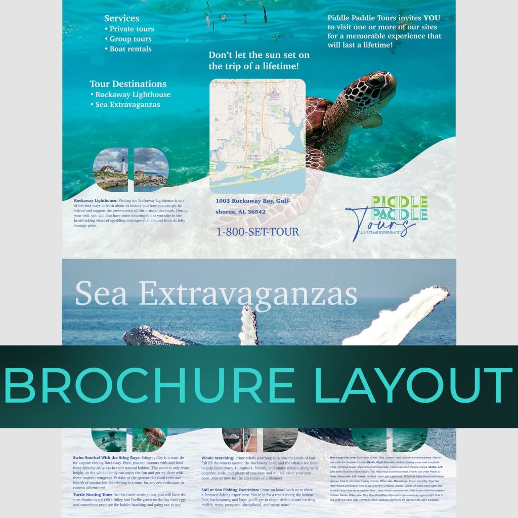
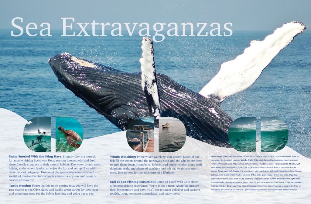
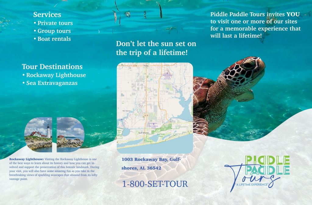
This double-sided trifold brochure promotes the tours, destinations, and services offered by Piddle Paddle Tours. It organizes the supplied copy and imagery while also providing practical information such as the company’s map, address, telephone number, and available tour options.
Large ocean photographs immediately establish the subject and create a sense of exploration. A repeating white wave moves across the bottom of the panels, supporting the water-based theme and connecting both sides of the brochure. Its reduced opacity allows the photographs to remain visible while creating a quieter surface behind the text. White and dark blue typography provides contrast and coordinates with the existing logo, while repeated rounded image frames and consistent type treatments unify the layout.
Business Card Design
Project Source: Client
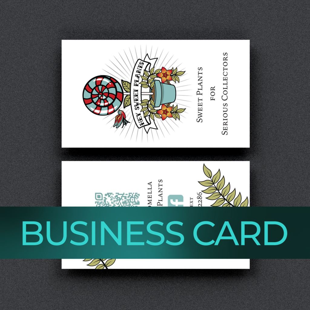
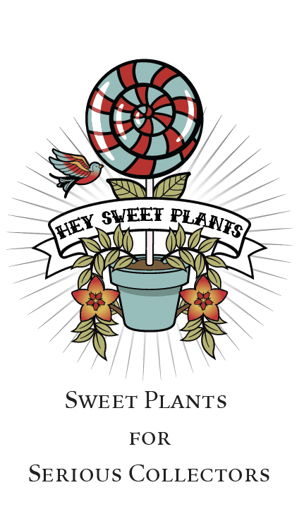
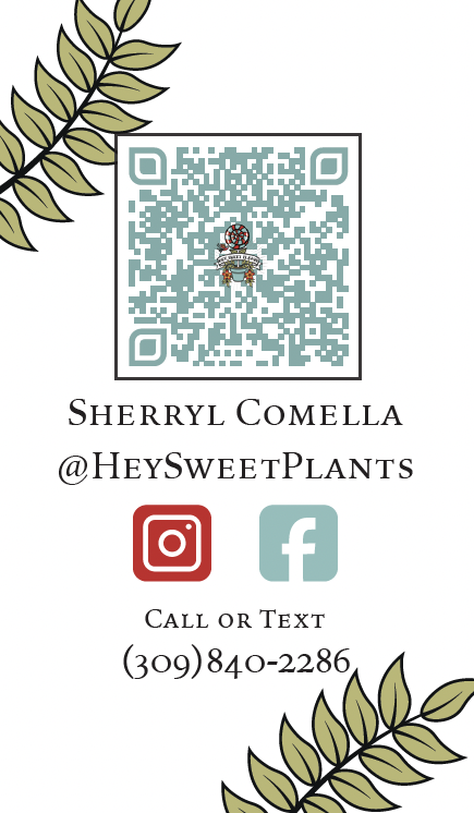
Hey Sweet Plants is a client-owned business serving serious collectors looking for rare and harder-to-find plants. The client already had an illustrated logo and tagline, so the goal was to extend that identity into a professional business card without losing its distinctive personality.
The front uses a centered composition to make the detailed, tattoo-inspired logo the focus. The reverse uses botanical illustrations to frame the QR code, social-media information, and telephone number while leaving enough white space for the details to remain readable. I presented three design concepts to the client. She selected the layout from one concept and the typeface from another, which I combined to create the final card. She was pleased with the result and later hired me to design an additional informational poster.
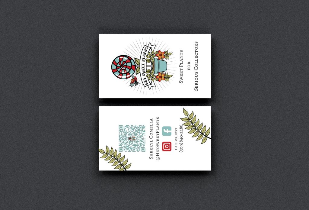
Mockup of Finalized Design
Business Card Options for Client
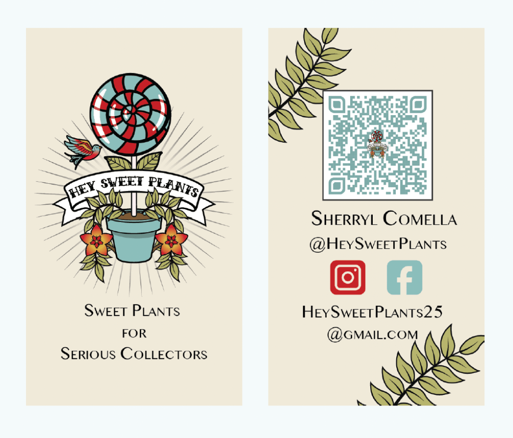
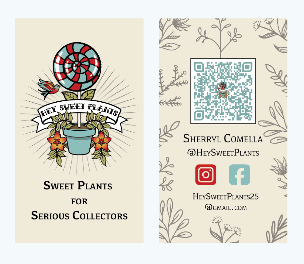
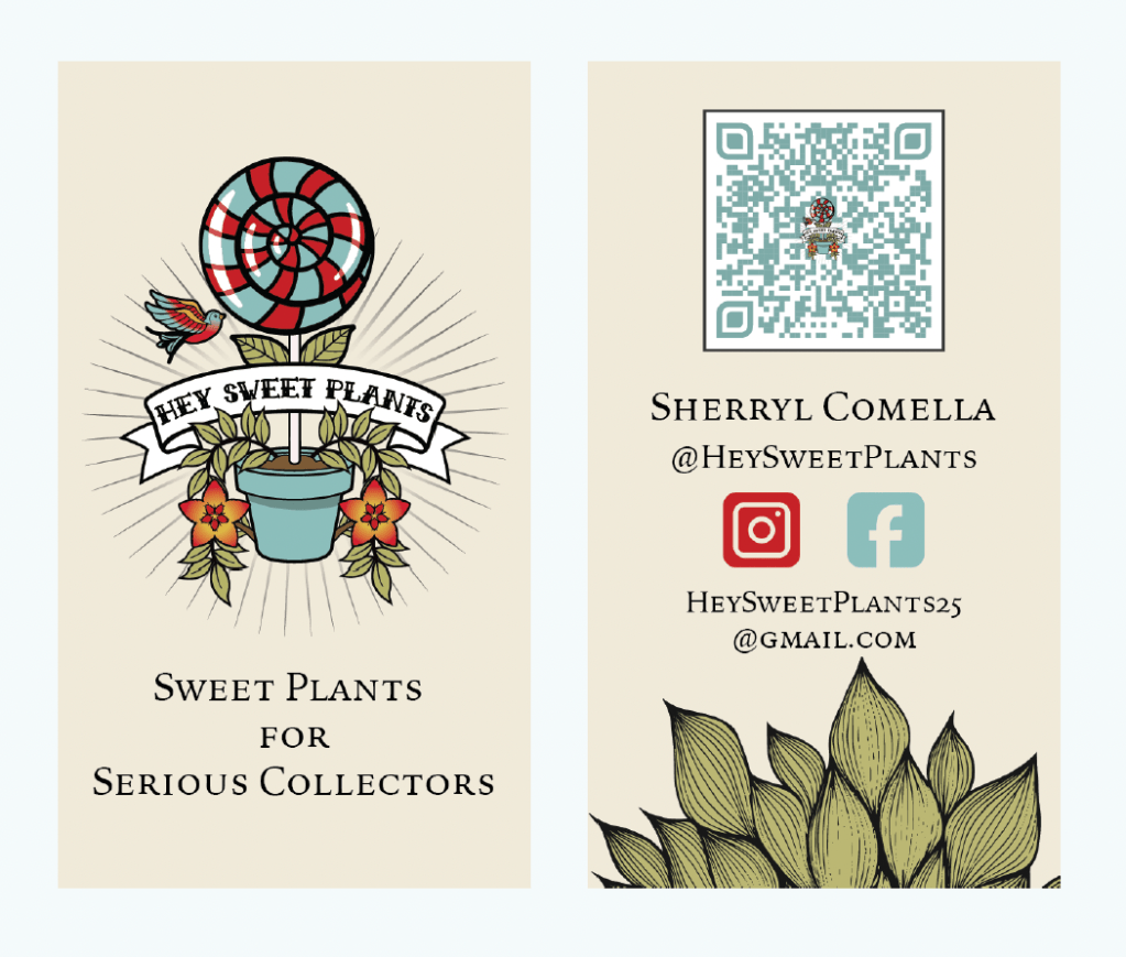
The three options given to the client. I encouraged the client to select elements from any of the cards for the final iteration, and they were informed feedback was welcomed. They chose a layout and typeface from separate versions to create the final design.

Posters and Flyers
Project Source: Coursework
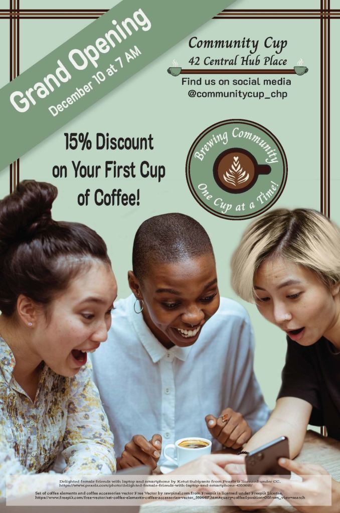
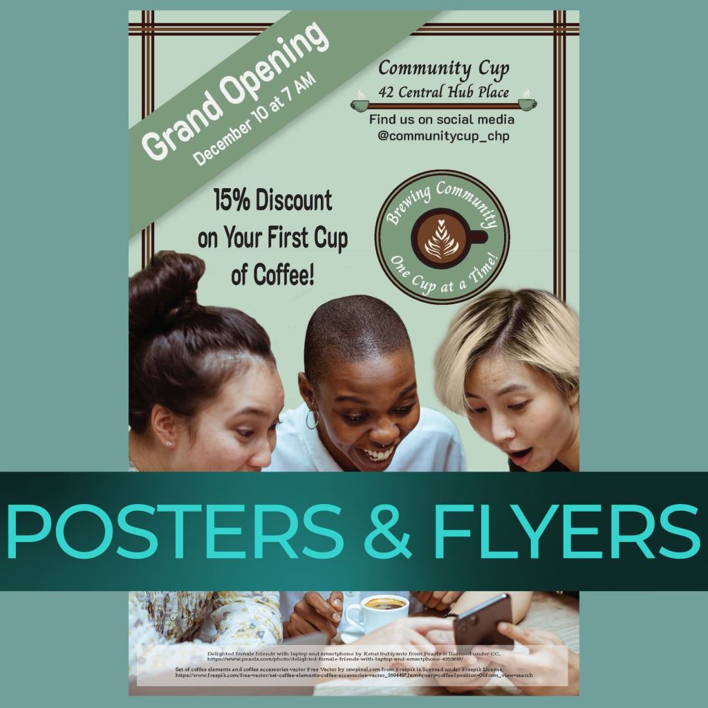
This poster was designed to introduce Community Cup as a welcoming place where members of the community could meet and connect. It promotes the coffee shop’s grand opening and first-cup discount while making the date, location, and social-media information easy to find.
The central photograph shows three friends enjoying coffee together and communicates warmth, diversity, and belonging. I repeated the number three through the three people, the three-line border, and the border’s placement on three sides of the composition. Coffee-inspired colors, prominent promotional messaging, and clear hierarchy help the design feel inviting while directing attention to the event and special offer.
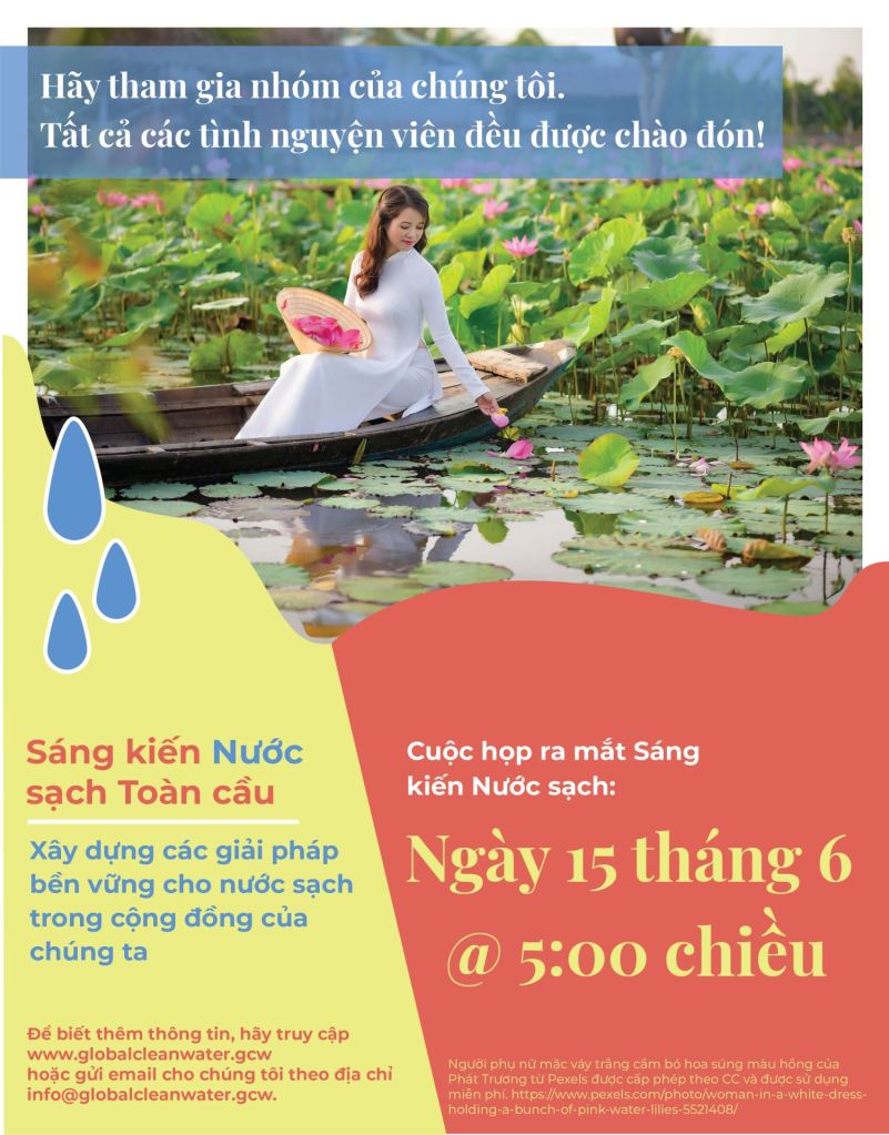
This flyer was designed to recruit volunteers and announce the launch meeting for the Global Clean Water Initiative. It needed to communicate the organization’s mission, meeting information, contact details, and call to action within a single 8.5-by-11-inch format.
Because the piece was intended for a Vietnamese context, I researched Vietnamese advertising, colors, typography, and imagery before developing the design. The image of a woman surrounded by lotus flowers creates a cultural connection while reinforcing the focus on water. Bright yellow and coral make the flyer feel warm and welcoming, while blue represents water and connects to the initiative’s purpose. Flowing color fields and repeated water-drop icons introduce movement, and contrasting serif and sans-serif typography establish a clear reading order.
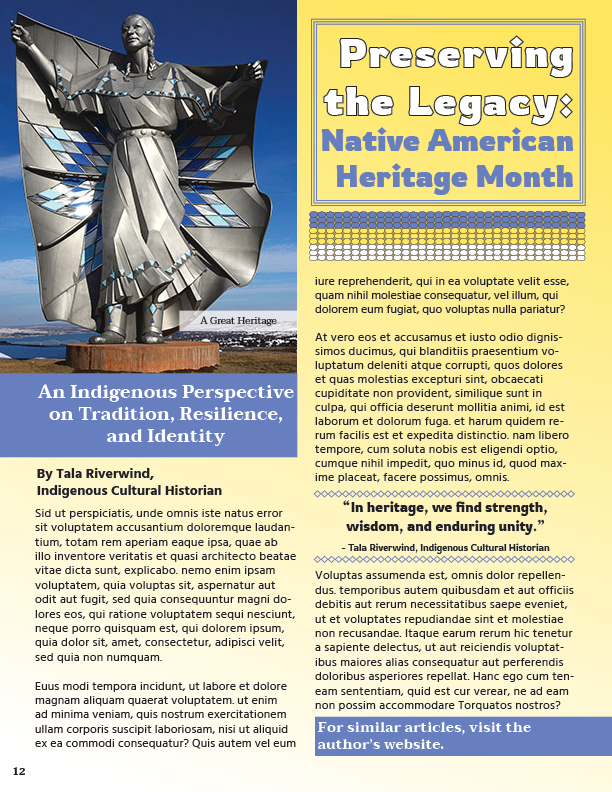
This magazine page was created to recognize Native American Heritage Month for readers between the ages of 12 and 18. The goal was to combine an engaging contemporary layout with respectful choices informed by research rather than selecting visual elements based only on appearance.
My research into Lakota color meanings guided the use and placement of yellow, white, and blue. Yellow begins in the upper eastern corner because of its association with the east, light, and the beginning of understanding. White extends from the south and represents life and intellect, while blue carries sacred meaning and creates contrast. Repeated diamond forms connect the photograph, title typography, pull-quote dividers, and beadwork-inspired graphic. Differences in typeface, size, weight, and placement establish hierarchy and guide readers through the page.
 Donna Newlun