
Please choose a project to find out more or scroll through the page to learn about each of them.
Bowlsome Smoothie Self-Ordering Kiosk
Project Source: Coursework
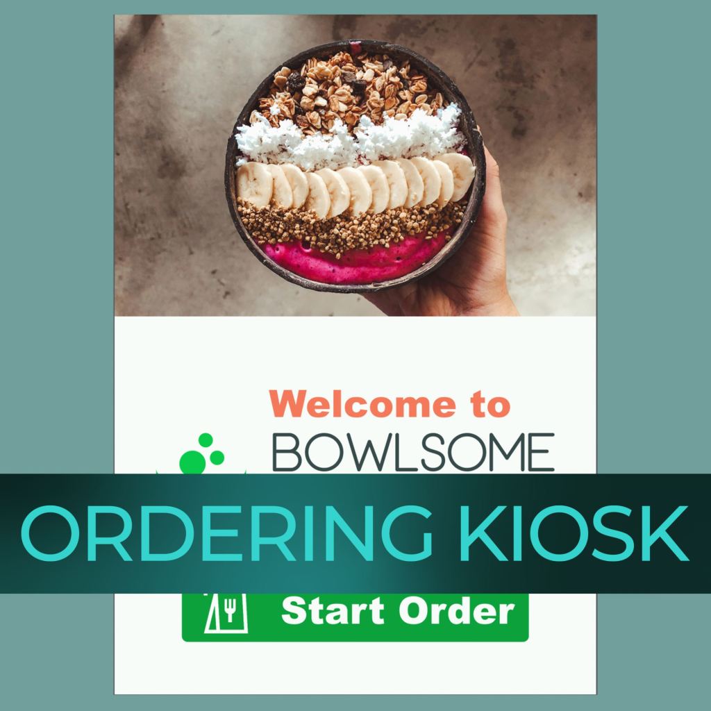
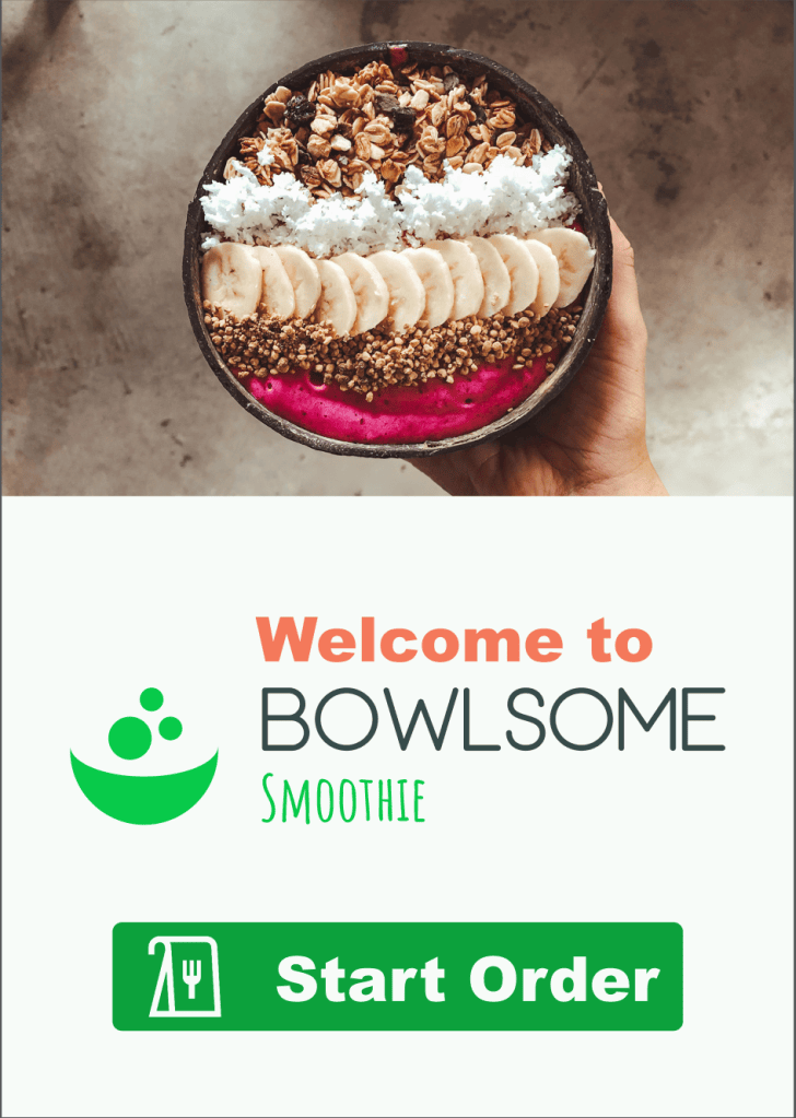
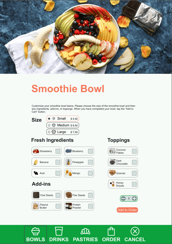
Bowlsome is an interactive self-ordering kiosk designed to help customers build and purchase customized smoothie bowls. The experience allows users to choose a bowl size and ingredients, review or edit an order, select a secure payment method, and request a receipt.
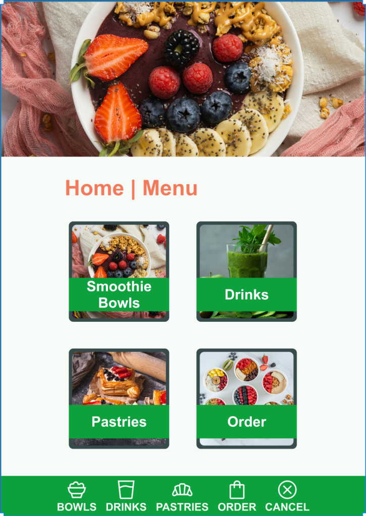
Accessibility was an important part of the design. Primary controls and navigation were positioned lower on the screen to make the kiosk easier for wheelchair users to operate. Green identifies navigation choices, while orange distinguishes actions such as adding an item or proceeding to payment. Relevant imagery, clear page titles, familiar controls, and a consistent bottom navigation system help users understand where they are and what to do next.
View the interactive prototype: CLICK HERE TO VIEW THE INTERACTIVE PROTOTYPE
Case Study
Bowlsome needed a self-ordering experience that allowed customers to customize smoothie bowls without making the process confusing or difficult to navigate. The kiosk also needed to accommodate wheelchair users, support order editing, provide secure payment choices, confirm completed orders, and offer receipts.
I began with wireframes to establish the layout and sequence of the ordering experience. Because the kiosk had to remain accessible to wheelchair users, I placed the primary interactive content and navigation toward the lower portion of each screen. The hero images appear above the controls, allowing the interface to remain visually engaging without moving important actions outside a comfortable reach range.
I created a color system that uses green for navigation and orange for actions. This distinction helps customers recognize whether a button will move them to another section or perform an action such as adding an item or proceeding to payment. Page titles, corresponding imagery, a consistent bottom navigation bar, and a straightforward menu taxonomy help users remain oriented throughout the experience.
Usability testing revealed that participants wanted additional navigation choices after adding an item. In response, I revised the “Item Added” overlay to provide a second method of continuing through the ordering process. This change gave users greater control and made the next step more apparent.
The completed prototype supports customization, order review, editing, payment, confirmation, and receipt selection. It demonstrates how accessibility, visual communication, and user feedback can work together to improve a digital experience.

Metropolis Capital Bank App
Project Source: Coursework
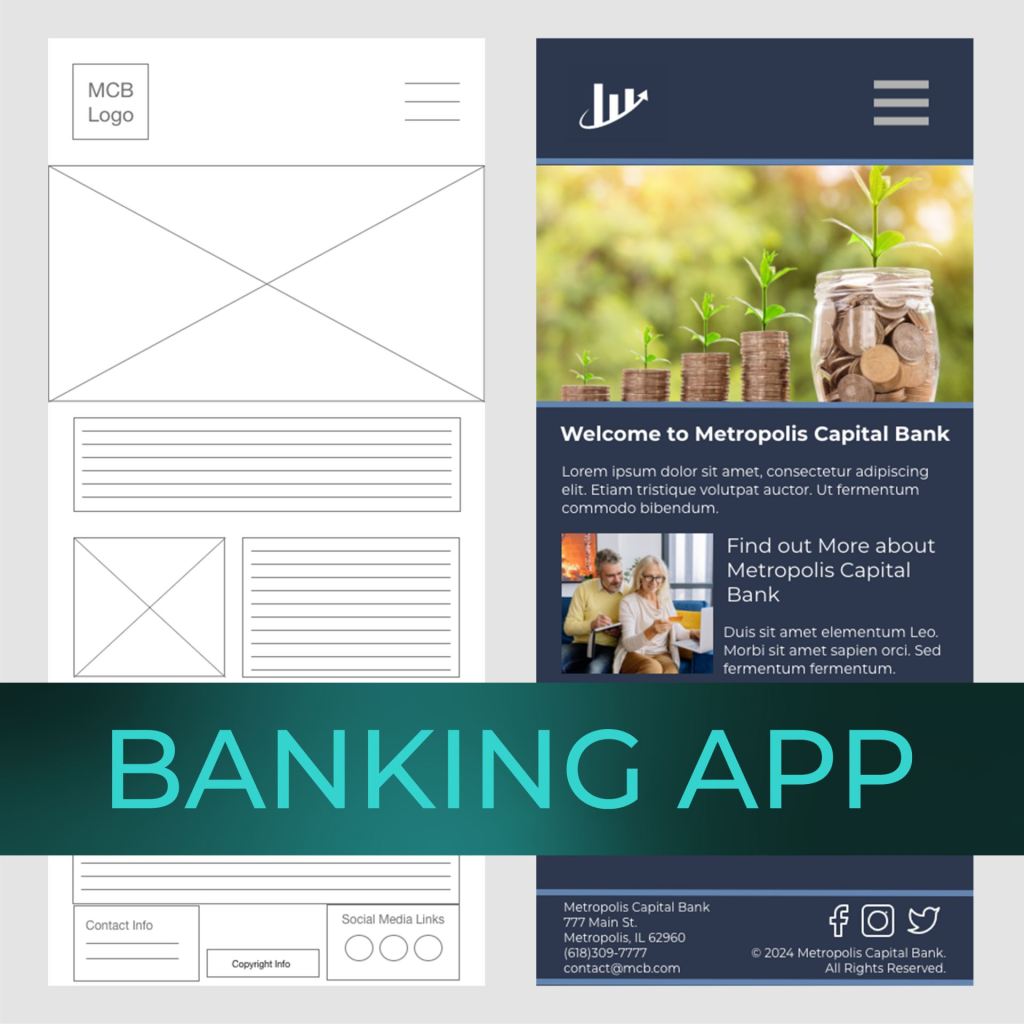
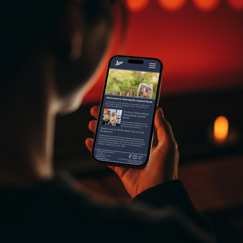
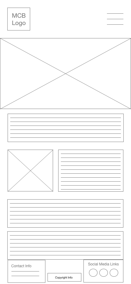
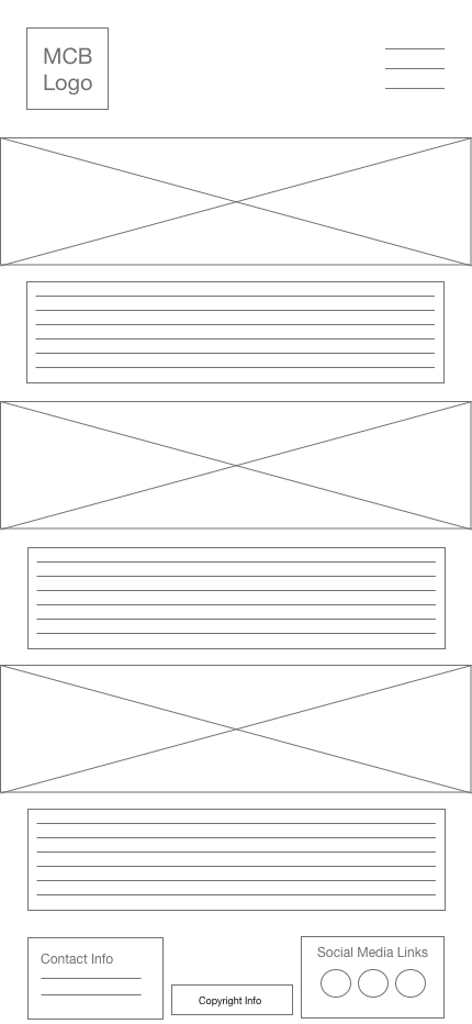
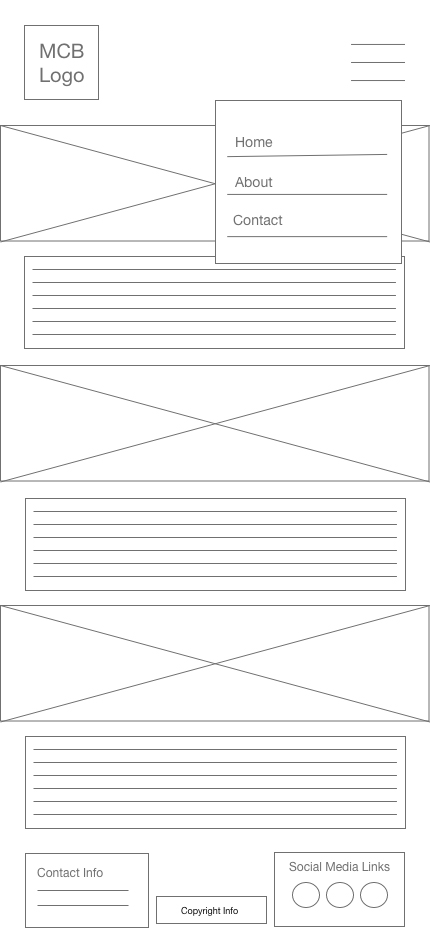
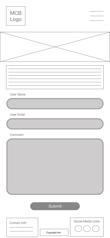
For this project, we were tasked with creating wireframes for three pages of a banking app, the home, contact, and about pages. Once our client (instructor) gave approval, we were free to create the high-fidelity mockup. The logo and all copy was given to us in the client brief.
The Wireframes
The wireframes were created to specifications with logo, footer, extended menu, and hero images.
The High-Fidelity Mockups
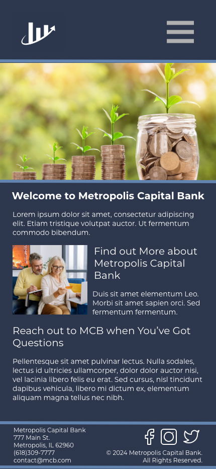
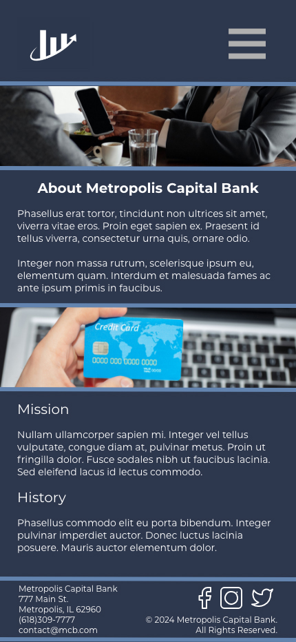
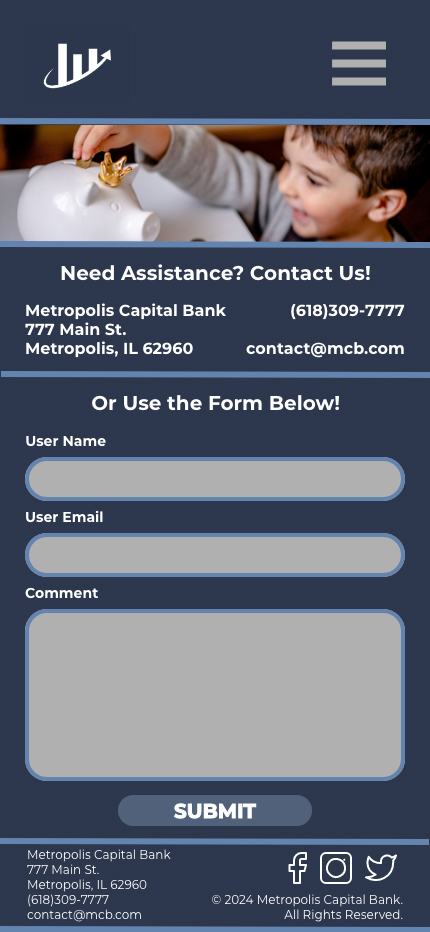
The high-fidelity mockups were created from the wireframes after receiving client (instructor) approval to move ahead to the next iteration. There were some minor changes that resulted in the final high-fidelity mockups.

Elephaid Foundation App
Project Source: Coursework
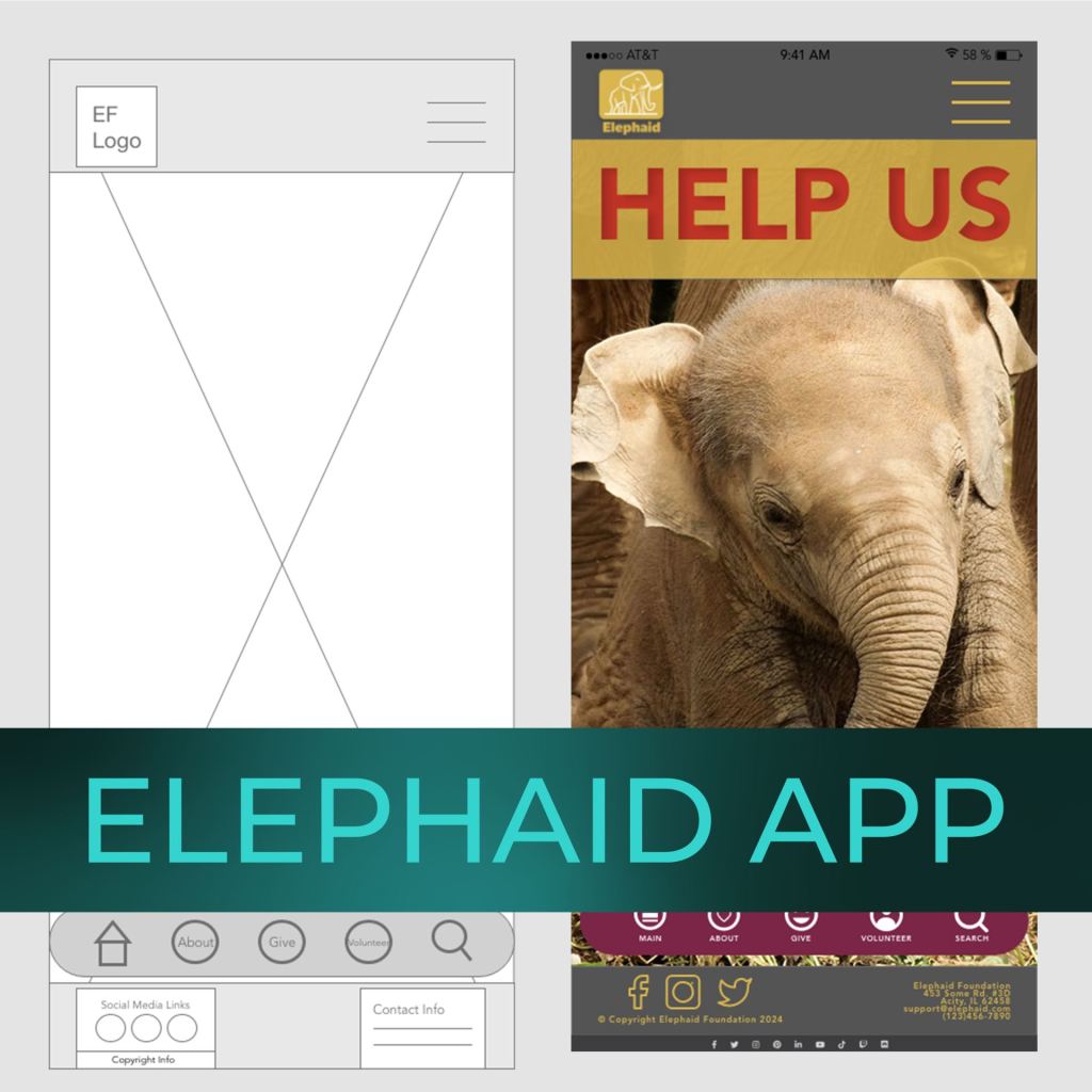
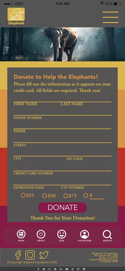
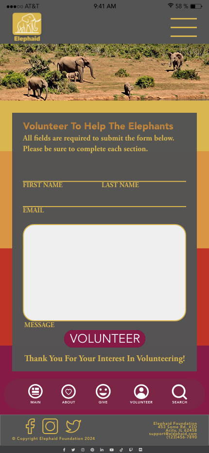
For this project we were tasked with creating pages for a foundation’s app that supports elephant rescue. The client brief and files contained the copy, images, logo, and color palette. We were asked to develop wireframes, and once approved moved on to creating high-fidelity mockups. After the client’s (instructor’s) feedback we were okay to begin the final iteration on the mockups.
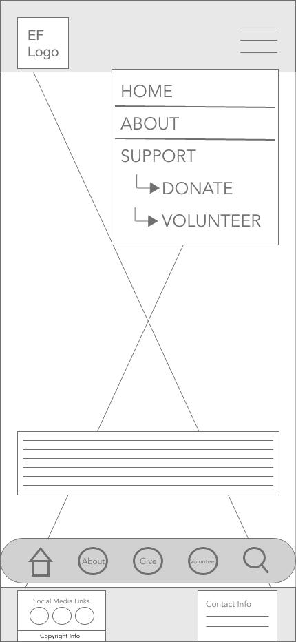
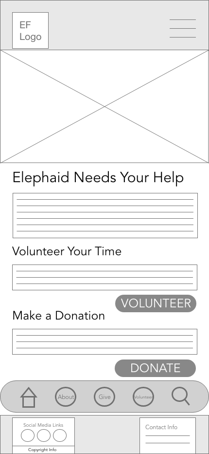
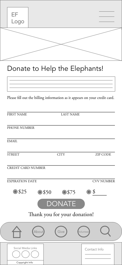
The client brief stated problems with user confusion and not understanding where to go. The two options for support were closely labeled which left users unsure which choice they needed. The forms were found to be taxing on the user and unclearly labeled. The site needed improved hierarchy as well as the fixes to taxonomy.
The Wireframes
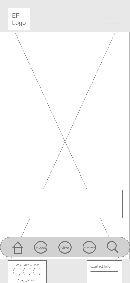
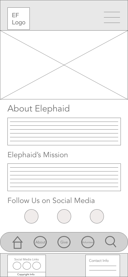
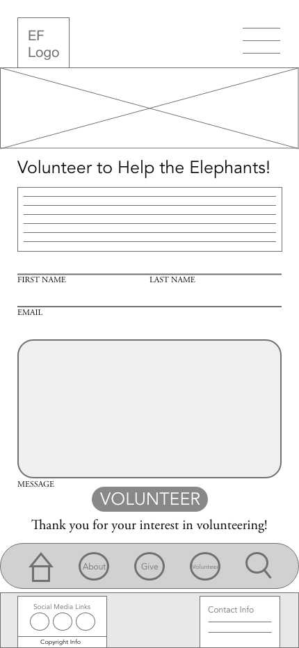
The wireframes were created to specifications including logo, hero images, improved taxonomy, improved hierarchy and the ability to navigate beyond the hamburger menu.
The High-Fidelity Mockups
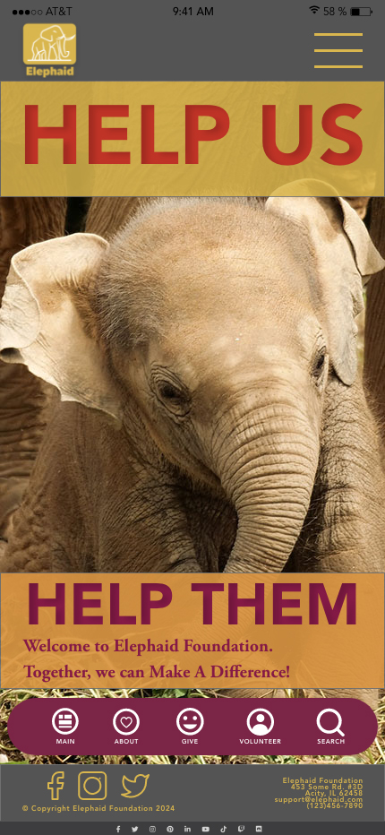
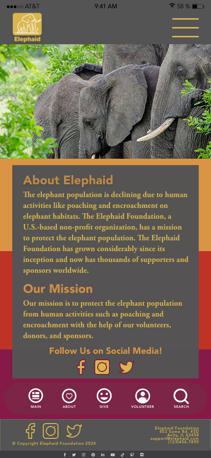
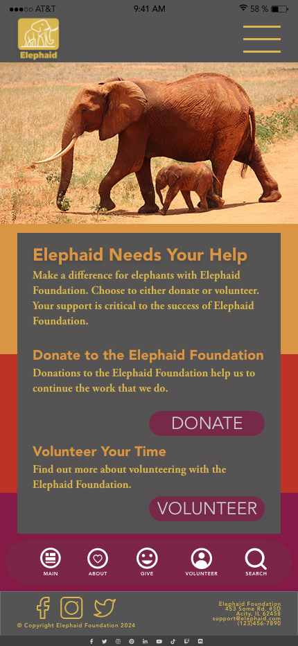
The high-fidelity mockups were created based on the wireframe approval with the client (instructor). After the first set of iterations on the mockups, we were given the opportunity for a final iteration on the design.
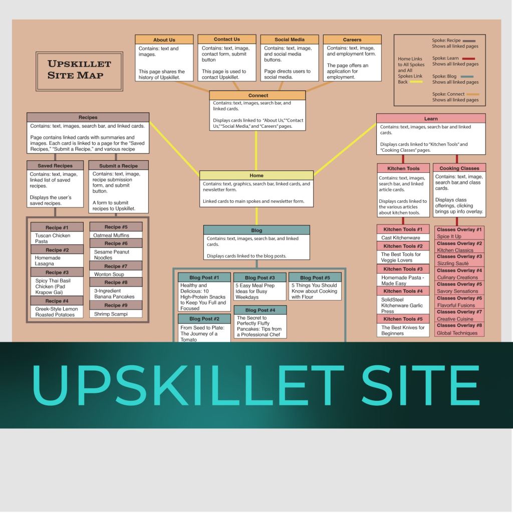
Upskillet Site Remap
Project Source: Coursework
 Donna Newlun